
When you look at the back of your phone or the lid of your laptop, you see more than just a piece of fruit. You see a symbol that represents a trillion dollar empire and a design philosophy that changed the world. But getting to this point wasn’t a straight line. If you are a business owner or a designer, there is a massive lesson to be learned here about how a brand identity can grow, fail, and eventually find its soul. I have spent years analyzing how visual markers influence consumer trust, and nothing quite compares to the evolution of that little bitten apple.
Most people think great branding is born perfect. In reality, Apple started with one of the most complicated and unprintable logos in tech history. It took a few “happy accidents” and a total shift in mindset to move from a cluttered drawing to the sleek silhouette we know today. Let’s walk through the actual story, including some of the details that often get left out of the standard history books.
The Newton Disaster And The Need For Simplicity
Back in 1976, Apple was just three guys in a garage. Ronald Wayne, the often forgotten third co founder, designed the first logo. It was a pen and ink drawing of Isaac Newton sitting under a tree with a glowing apple about to fall on his head. It looked more like a label for a bottle of craft ale or a medieval manuscript than a technology company logo. It was beautiful in its own way, but as a brand mark, it was a nightmare.
Imagine trying to shrink that drawing down to fit on a small circuit board or a pen. It would turn into a blurry smudge. Steve Jobs realized very quickly that if they wanted to sell the future, they couldn’t look like the past. Wayne sold his 10% stake in the company for just $800 shortly after, and Jobs went looking for a professional who could simplify the vision. This was the first major pivot in the Apple logo history and perhaps the most important one. It teaches us that your brand shouldn’t just be “pretty” it must be functional across every medium.
Why The Rainbow Had A Bite Taken Out Of It
In 1977, Rob Janoff was hired to create something modern. He came back with the iconic apple shape featuring a bite taken out of the side. There are countless myths about why that bite exists. Some say it is a tribute to Alan Turing, the father of computer science who died after eating a poisoned apple. Others think it is a play on the word “byte.”
Here is the insider truth from the designer himself: the bite was added for scale. Without it, a small version of the logo looked exactly like a cherry. The bite made it undeniably an apple.
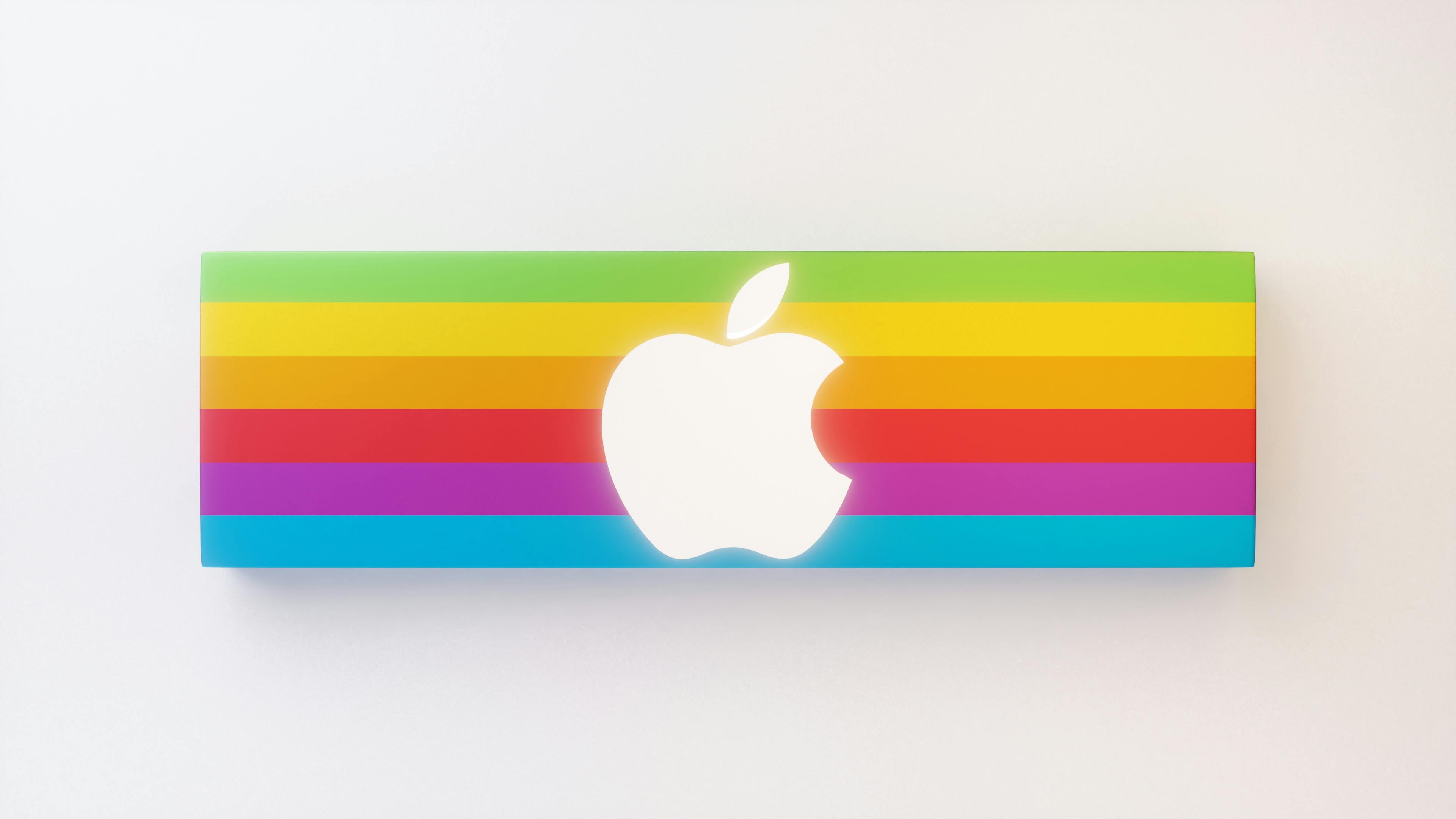
The rainbow stripes were another specific request from Jobs. He wanted to humanize the company, but there was a technical reason too. The Apple II was the first personal computer that could display colors on a monitor. The rainbow logo was a direct advertisement of that “cutting edge” feature. At the time, printing a logo with six colors was incredibly expensive, but Jobs insisted on it. He knew that the visual identity was worth more than the printing costs.
Skeuomorphism And The Return To Luxury
By the time the late nineties rolled around, the rainbow was starting to look a bit dated. When Jobs returned to the company in 1997, he knew he had to save Apple from bankruptcy. Part of that rescue mission involved moving the brand away from being a “quirky computer company” and toward being a high end luxury powerhouse.
This is when we saw the shift to the monochrome logo. First, it was a translucent blue to match the Bondi Blue iMacs, and then it moved into the black and silver versions. During this era, Jobs became obsessed with a design style called skeuomorphism. This is where digital elements look like real world objects. You might remember the glossy, glass like Apple logos from the early 2000s. They looked like they were made of physical material you could touch. This helped users transition into the digital age by making tech feel familiar and grounded.
Moving Toward The Minimalist Flat Design
As we moved into the 2010s, the world didn’t need “glass” buttons to understand how to use a phone anymore. Design trends shifted toward “flat design,” which strips away all the shadows, gradients, and textures. The Apple logo followed suit, becoming the clean, solid icon we see today.
This minimalist approach aligns perfectly with their hardware. When you have a device made of high grade aluminum and glass, you want a logo that doesn’t compete with the material. A flat logo looks more premium because it doesn’t try too hard. It relies on the strength of the shape itself. If you want to understand more about how these design principles impact user psychology, looking into user experience research can give you a better idea of why “less is more” usually wins.
Surprising Facts From Behind The Scenes
Beyond the design shifts, there are some quirks about the company that show just how meticulous they are with their image. Every detail is curated to create a specific feeling of precision and quality.
The 9:41 Rule. If you look at any official Apple ad for an iPhone, the time is almost always set to 9:41. This is because Jobs unveiled the first iPhone at approximately 41 minutes into his keynote presentation in 2007. They want the ad to match the historical moment of the reveal.
Cash King. Apple often holds more liquid cash than the United States Treasury. This gives them the power to buy up entire supply chains or invest in experimental tech without asking for permission.
The Missing Calculator. To this day, the iPad does not have a native, built-in calculator app. Legend has it that the original design was just a scaled up version of the iPhone app and Jobs thought it looked terrible, so he pulled it at the last minute. The team hasn’t found a “perfect” way to do it since.
The Clothing Line. In 1986, they actually tried to launch “The Apple Collection” which included baggy sweatshirts and hats with the rainbow logo. It was a massive failure, but it is a fun reminder that even the best brands have to experiment to find their lane.
Why This Logo Still Wins Today
The reason the Apple logo works so well is that it follows the “Golden Ratio.” The curves of the apple, the leaf, and the bite are all mathematically balanced to be pleasing to the human eye. It feels “right” even if you don’t know why. But more than the math, it works because it is a promise. When you see that logo, you expect a certain level of performance and a specific type of user experience.
If your own brand is feeling a bit cluttered or outdated, look at the Apple logo history for inspiration. They weren’t afraid to kill off a complicated design for a simple one. They weren’t afraid to ditch the colors when the market changed. A logo isn’t a static drawing; it is a living part of your company that should grow alongside your vision. If you haven’t looked at your branding in a few years, it might be time to ask if you are still in the “Newton” phase or if you are ready to simplify for the future.